My role
Graphic design
Creation of the upcoming logo
Typographic choice
Chi Regular adds personality to the logo, while Karla allows for clear
and pleasant reading.
Chi
Aa Bb Cc Dd Ee Ff Gg Hh Ii Jj Kk Ll Mm Nn
Oo Pp Qq Rr Ss Tt Uu Vv Ww Xx Yy Zz
123456789 !@/$%?&*
Karla
Aa Bb Cc Dd Ee Ff Gg Hh Ii Jj Kk Ll Mm Nn
Oo Pp Qq Rr Ss Tt Uu Vv Ww Xx Yy Zz
123456789 !@/$%?&*
Design objective:


Typographic choice
Chi Regular adds personality to the logo, while Karla allows for clear and pleasant reading.
Chi
Aa Bb Cc Dd Ee Ff Gg Hh Ii Jj KkLl Mm Nn
Oo Pp Qq Rr Ss Tt Uu Vv Ww Xx Yy Zz
123456789
!@/$%?&*
Karla
Aa Bb Cc Dd Ee Ff Gg Hh Ii Jj KkLl Mm Nn
Oo Pp Qq Rr Ss Tt Uu Vv Ww Xx Yy Zz
123456789
!@/$%?&*
Color chosen
The color palette was chosen to create
a warm and reassuring atmosphere.
Faded Jade
HEX: 3D796F
Mango Orange
HEX: FF7A37
Timberwolf
HEX: DED6C8
Mango Orange
HEX: FF7A37
Rosso Corsa
Ikebana
Japanese pastry shop specializing in taiyakis.
Color chosen
Rosso Corsa
HEX: D61300

Context
The mandate for this project was to create a logo for a pastry shop specializing in taiyaki, a traditional Japanese fish-shaped pastry. The logo had to evoke the world of the product while remaining simple, recognizable, and suitable for use on different media.
The project involved creating a logo for a pastry shop specializing in taiyaki, Japanese fish-shaped cakes. The logo had to reflect the product's image while remaining simple, recognizable, and adaptable to different media.
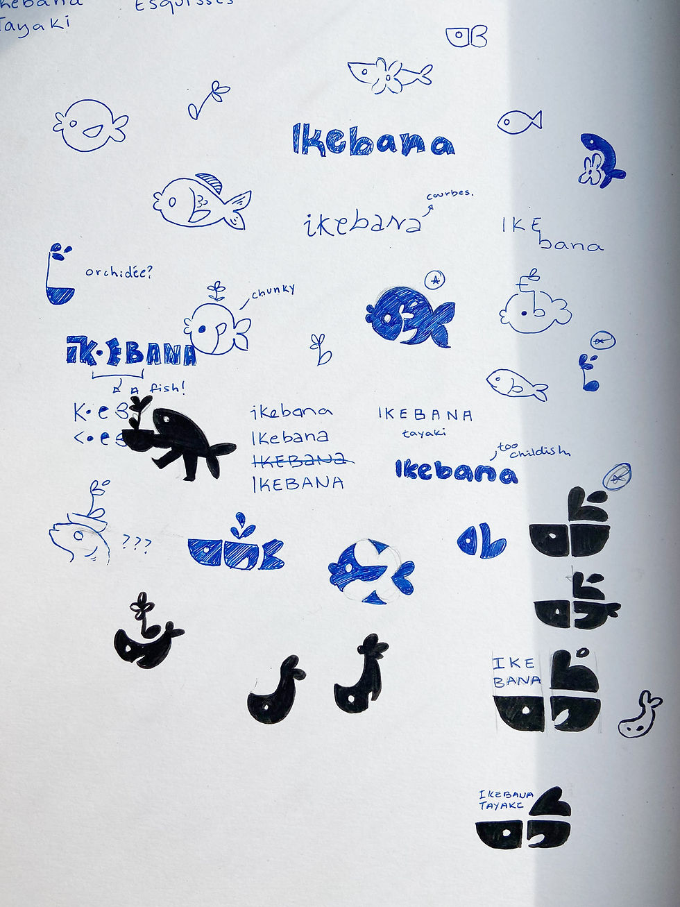
Sketches and ideas
This step involved sketching different logo options. Being a specialty pastry shop
in taiyaki, the emphasis was placed on the shape of the fish.
This step involved sketching different logo concepts. Being a pastry shop specializing in taiyaki, the emphasis
was placed in the shape of a fish.
The final logo was chosen for its visual balance and consistency with the project's objectives.
It incorporates both the flower and the fish, in accordance with the mandate.
Final product
The switch to high fidelity allowed
to bring the project's visual identity to life.
By adhering to WCAG standards, the color
Typography is used to prioritize information, while the balance between rounded corners and square structures ensures comfort.
Visual appeal and precision. Here are a few examples.
The final logo was chosen for its visual balance and consistency with the project's objectives. It incorporates both the flower and the fish, in accordance with the brief.
The final logo captures the playful and indulgent universe of the bakery. Simple yet distinctive, it works seamlessly across all touchpoints while spotlighting the taiyaki, the brand’s iconic symbol.

